


You’ve probably lived this déjà vu: someone pitches a shiny new feature, the slides are filled with screenshots of chat interfaces or “copilots,” and there’s a passing reference to OpenAI or Anthropic. Everyone nods politely. A pilot is greenlit.
Three months later - nothing.
No metric moved. No one adopted it. The project limps along because nobody wants to admit it failed.
This isn’t the exception, it’s the rule. 90% of AI projects don’t actually work. Not because the models fail to generate output. They work in that narrow sense. They fail in the more important sense: they don’t change a KPI, they don’t create adoption, and they don’t survive the first quarter once the demo excitement fades.
The 10% that succeed stick. They scale. They generate incremental revenue or reduce cost in ways you can see in the P&L. I’ve seen those rare wins add hundreds of millions to the bottom line.
The obvious question: how do you spot the 10% and not waste time on the 90%?
Why most AI projects die
The biggest killer isn’t AI performance. It’s novelty bias.
A founder sees ChatGPT draft an essay and imagines an AI chatbot for their product. An exec hears a competitor talk about “copilots” on an earnings call and suddenly every team is tasked with building one.
But novelty is not impact, and if you’ve ever built anything, you know this. Impact comes from solving a problem that already hurts, in a place users already live, with data you actually own, tied to a metric the business already cares about.
When you flip the lens from “what’s new?” to “what moves numbers?”, the 10% stand out clearly.
The PROVE-IT Filter: 7 Rules That Predict Which AI Projects Will Fail (and Which Will Stick)
Over the last few years, I’ve reviewed hundreds of AI product ideas, from scrappy prototypes to global roadmaps. The same pattern always shows up: the successful ones share the same DNA.
That DNA lives in a filter I call PROVE-IT (pretty consistent with my first response to every AI pitch I hear). My filter turns hand-wavy excitement into a concrete go/no-go decision.
Pain: The problem has to be hair-on-fire. If it doesn’t connect directly to a revenue leak, an operational bottleneck, or a customer frustration that already has budget and urgency, adoption odds drop sharply.
Reach: The solution must live inside the user’s existing workflow or journey. If it demands a new app, tab, or process change, expect abandonment. Impact only compounds when the AI is embedded where work already happens.
Owned Data: Proprietary signals are the moat. Logs, transactions, outcomes, and labeled history that only you have access to, and that can’t be trivially replicated by a competitor or model provider, make the system defensible.
Verifiability: Every strong AI project has a single KPI that can be measured weekly. That might be conversion, SLA adherence, average order value, containment, or refund rate. If success can’t be expressed in one crisp metric, it usually won’t last.
Execution Loop: Good systems learn. They take user actions -- clicks, edits, corrections, returns -- and feed them back into the product so it improves week after week. Static prompts without feedback loops stall quickly.
Integration Time: A project that takes six months before seeing real data rarely survives. Fast integration de-risks impact and builds confidence.
Total Cost of Ownership: Unit economics need to hold as usage scales. Inference costs, retrieval layers, human review, and compliance overhead all matter. If cost grows faster than value, the project collapses under its own weight.
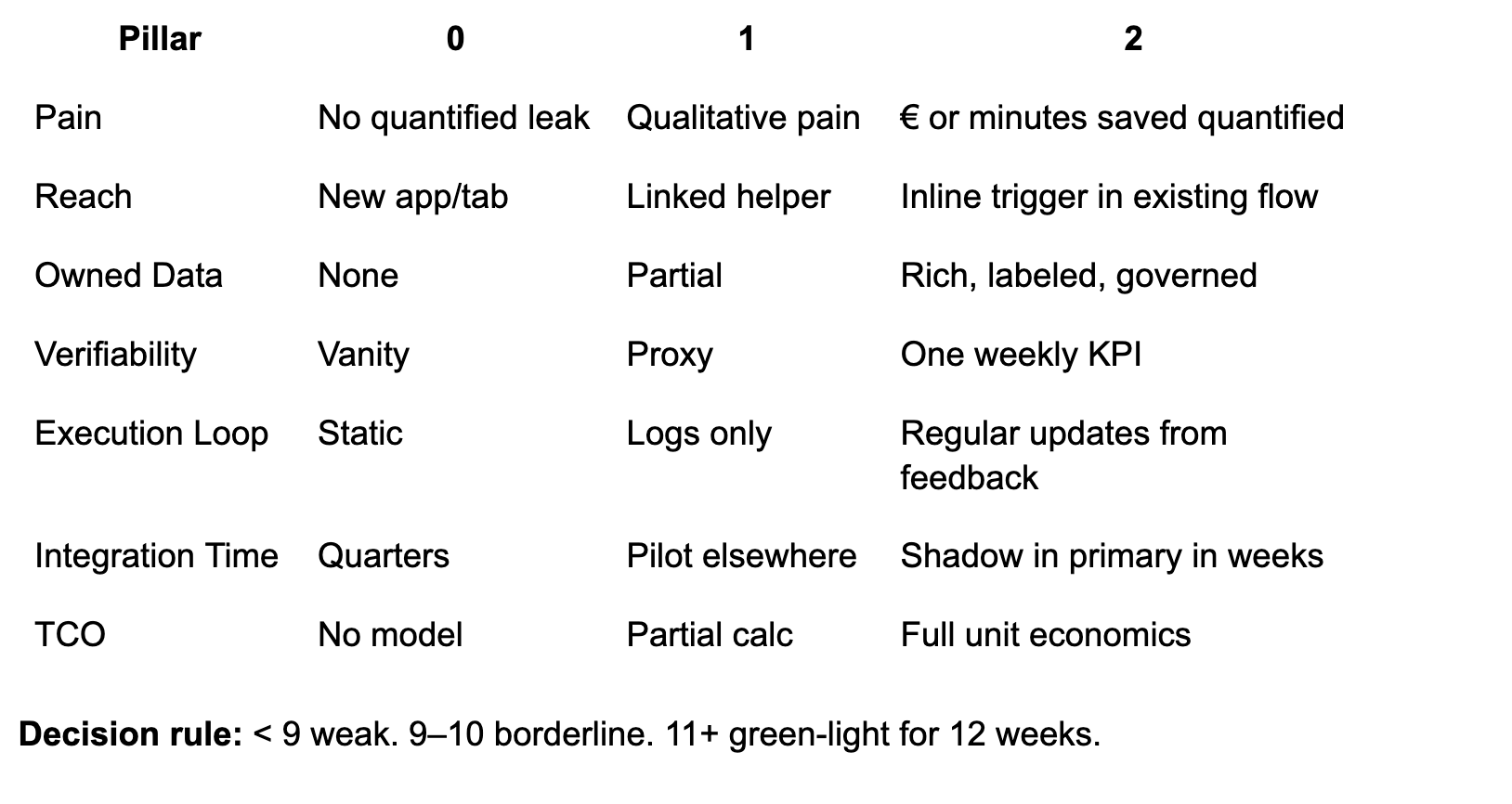
Each project gets a score from 0–2 on every dimension. If something lands below a 9, it’s weak. Anything 11 or higher is worth testing in an 8–12 week sprint with clear metrics.
The PROVE‑IT Field Guide
Scoring: Each line item gets 0–2. Below 9 is weak. 11+ is worthy of the next 12 weeks.
Scale: 0 = missing or hand‑wavy, 1 = partial or unproven, 2 = strong, evidenced.
P: Pain: “Hair‑on‑fire or nice‑to‑have?”
What it means: Ties directly to a leak (cost), bottleneck (throughput), or urgent frustration (NPS).
Score rubric:
0: Vague “delight” pitch, no money or minutes at stake.
1: Qualitative pain without quantified stakes.
2: Quantified leak or delay with owner and budget.
How to test this week: Pull last 90 days of tickets, refunds, or cycle times. Put euro or minute signs next to each.
R: Reach: “Inside the user’s existing path”
What it means: Lives where work already happens, ideally auto‑invoked.
Score rubric:
0: New app or tab with context switching.
1: Deep‑link from existing tool.
2: Inline in the flow, triggered by the event that creates the need.
Proof in the wild: Gmail’s Smart Reply and Smart Compose sit in the inbox and auto‑suggest replies; at launch Smart Reply generated ~12% of mobile replies in Inbox, a classic “in‑flow” win. Workspace Updates Blog
O: Owned Data: “Do we have a moat?”
What it means: Proprietary signals or history others can’t copy: clickstreams, outcomes, refunds, SLAs, process docs, device or call audio.
Score rubric:
0: Public web + generic LLM.
1: Limited first‑party logs without outcomes.
2: Rich first‑party data with labels/outcomes and compliance clarity.
How to test this week: List top 10 tables or stores you control. For each, mark: freshness, coverage, and whether outcomes are labeled.
V: Verifiability: “One weekly KPI”
What it means: A single metric the team can move and defend.
Examples: AHT, CSAT, repeat‑contact rate, conversion, Average Order Value, refund rate, SLA%, developer cycle time.
Score rubric:
0: Vanity metrics or subjective “wow”.
1: Proxy metric without business linkage.
2: Primary KPI with baseline, target, owner, and dashboard.
Proof in the wild: For Microsoft 365 Copilot, controlled studies and TEI analyses track time saved by task (e.g., ~20% on email writing, ~30% on search, ~34% on content creation). Whatever you think of ROI studies, the KPI is explicit and measurable weekly. Forrester
E: Execution Loop: “Gets better with feedback”
What it means: Productized learning from clicks, edits, thumbs, returns, QA outcomes.
Score rubric:
0: Static system.
1: Logging exists, but no updates.
2: Regular retrains or policy updates; in‑product feedback visibly improves results.
How to test this week: Ship explicit feedback affordances (accept, edit, reject). Close the loop with a weekly model or heuristic update.
I: Integration Time: “Shadow mode in weeks”
What it means: Thin slice ships into shadow or assist mode fast, with human‑in‑the‑loop.
Score rubric:
0: Big‑bang build.
1: Pilot in a new tool or subset of users.
2: Shadowing real traffic in the primary surface within weeks.
Proof in the wild: Klarna launched an AI support agent that immediately shouldered real workload in‑flow; shipping quickly in the primary channel mattered. Klarna Italia
T: Total Cost of Ownership: “Unit economics survive scale”
What it means: Costs scale sub‑linearly vs. value. Model, retrieval, inference, human review, compliance, and re‑training all counted.
Score rubric:
0: “We’ll figure out cost later.”
1: Rough per‑interaction math without adoption curve.
2: Full P&L view with sensitivity to token prices, guardrail costs, and human fallback.
The PROVE‑IT scorecard
Real‑world snapshots mapped to PROVE‑IT
1) Microsoft 365 Copilot in knowledge work
What was built and why: Knowledge workers spend countless hours on repetitive tasks like email, document search, and summarization, creating a clear pain point. The solution integrates directly into Word, Outlook, and Teams, eliminating context switching and placing AI where the work already happens. Its impact is verifiable through a simple KPI [time saved per task] with studies showing consistent 20–30% efficiency gains. And because the system improves through tenant feedback and policy updates, accuracy and guardrails get stronger over time, creating a product that delivers compounding value the longer it runs.
Evidence: Forrester TEI reports average time savings like ~20% on email writing and ~30% on search; UK public‑sector trials documented meaningful daily minutes saved across thousands of employees. ForresterGOV.UK
Example score: P2 R2 O2 V2 E1 I1 T1 = 11.
Note on evidence quality: Microsoft‑ and partner‑run studies skew positive; third‑party reporting occasionally questions magnitude, so insist on your own baseline and measurement.
2) UPS ORION route optimization
What was built and why: Delivery routes were a classic “hair-on-fire” problem [fuel waste, driver inefficiency, and delayed packages all eroded margins]. UPS developed ORION (On-Road Integrated Optimization and Navigation), an AI optimization engine embedded into driver workflows. With proprietary GPS, package, and driver data across millions of routes, UPS had an unmatched data moat. Impact was tracked through clear KPIs: miles saved, fuel reduction, CO₂ emissions avoided, and on-time delivery performance.
Evidence: UPS reports ~100M miles and ~10M gallons saved annually after deployment -- hundreds of millions in operational savings. GlobeNewswiresupplychaindive.com
Example score: P2 R2 O2 V2 E2 I0 T1 = 11.
3) Wendy’s FreshAI for drive‑thru ordering
What was built and why: Peak-time labor shortages and slow order throughput created a visible bottleneck at Wendy’s drive-thrus. The company introduced FreshAI, a voice-ordering assistant integrated directly into the ordering lane, where customers were already speaking to place orders. The key metrics are service time, order accuracy, and upsell effectiveness. While the system benefited from fast integration into physical drive-thrus, feedback loops and consistency across accents, background noise, and menu complexity remain challenges.
Evidence: Expansion plan to 500–600 locations with reported ~22 seconds faster service and near‑99% order accuracy at pilots; industry peers show mixed outcomes, so instrumentation matters.
Business Insiderrestaurantdive.comExample score: P2 R2 O1 V1 E1 I1 T1 = 9.
Counter‑example, same pattern: DoorDash ended its voice‑ordering pilot in 2025 -- a reminder to validate accuracy, edge cases, and unit economics in shadow before scaling. BloombergRestaurant Business Online
4) Stripe Radar fraud prevention
What was built and why: Online payments are constantly exposed to fraud risk, creating both direct financial loss (chargebacks) and indirect cost (false positives blocking legitimate customers). Stripe built Radar directly into its checkout and payments flow, embedding AI where the transactions already happen. Its moat comes from proprietary cross-network fraud data, enriched by outcomes and labels at global scale. The KPI is sharp: reduction in fraud rate with controlled false positives. Radar continuously retrains on outcomes, feeding fraud decisions back into the model to improve accuracy at scale.
Evidence: Stripe reports users see ~42% SEPA and ~20% ACH fraud reduction on average with Radar’s new models. Stripe
Example score: P2 R2 O2 V2 E2 I2 T2 = 14.
5) Gmail Smart Reply / Compose
What was built and why: Email is a universal time sink, with knowledge workers spending hours drafting routine responses. Google built Smart Reply and later Smart Compose directly into Gmail, meeting users inside their existing workflow with zero friction. The moat came from proprietary training data [billions of anonymized email threads] with real response outcomes. Success was tracked through a simple KPI: adoption and usage of suggested replies. The system improved through user edits and accept/reject signals, forming a natural feedback loop that sharpened predictions over time.
Evidence: At launch, Smart Reply generated ~12% of all replies in Google’s Inbox app, scaling to billions of characters saved each week once rolled into Gmail. Over time, Google has emphasized efficiency gains and adoption at massive scale across its user base.
Example score: P1 R2 O1 V2 E2 I2 T2 = 12 (slightly lower on Pain and Owned Data, since time saved per email is useful but less acute than cost or revenue drivers, and training relied heavily on scale rather than uniquely owned business-critical data).
Workspace Updates BlogUniversity of Calgary in Alberta
How to run PROVE‑IT in your org
1) Week 0–1: Baseline and thin slice
Define the one KPI and baseline it for 4 weeks of historical data.
Pick the surface you already own (e.g., search box, ticket console, compose box).
Ship a thin slice in shadow: log model suggestions, human decisions, cost per suggestion, and “edit distance.”
Events to instrument:
suggest_shown,suggest_accepted,edit_distance,task_time,fallback_triggered,token_cost_eur.
2) Week 2–4: Close the loop
Feedback UX: thumbs, edit‑before‑send, “good vs safe to ship”.
Weekly updates: retrain heuristics or models; publish “what improved” changelog.
Guardrails: auto‑fallback rules and blocked intents.
3) Week 5–8: Controlled exposure
Holdout design: user‑ or session‑level A/B.
Human‑in‑the‑loop: queue low‑confidence cases to reviewers; learn from corrections.
Cost controls: cache, truncation, and retrieval; measure effective cost per accepted outcome.
4) Week 9–12: Scale or stop
Unit economics review:
Value per action: minutes saved × loaded hourly rate, or revenue delta × margin.
Cost per action: model + retrieval + orchestration + review overhead.
Adoption: % of eligible actions where AI is accepted.
Decision: Kill, iterate, or scale with hard gates.
Common failure modes and how PROVE‑IT catches them
Chatbot in a new tab fails Reach. Expect abandonment even if the model is “good.”
Cool demo with public data fails Owned Data. Anyone can copy it.
Laundry list of metrics fails Verifiability. Pick one KPI and live by it.
Static prompts fail Execution Loop. Improvements stall after Week 2.
Quarter‑long integration fails Integration Time. Push for shadow mode in the primary surface fast.
Ignoring review labor fails TCO. Human‑in‑the‑loop costs can swamp token savings.
A few playbooks you can borrow
Support assistant: Shadow‑mode suggestions + containment rate + edit distance; promote to agent‑assist then to partial autonomy by intent. Klarna’s trajectory shows why containment and AHT are the north stars. Klarna Italiacustomerexperiencedive.com
Knowledge worker copilot: Task‑level time trials per artifact type; Microsoft’s task‑specific minutes saved is the right granularity. Forrester
Ops optimization: Start with deterministic heuristics, then learn residuals; measure miles or minutes saved like ORION. GlobeNewswire
Voice ordering: Gate by confidence and fallback fast; scale only when service time and accuracy match human benchmarks. The DoorDash reversal is your cautionary tale. BloombergRestaurant Business Online
Fraud: Optimize both containment and false positives; Stripe’s cross‑network signals showcase the power of Owned Data at scale.Stripe
Startups vs scaleups: different lenses
The same filter works in both contexts, but what you weight changes.
Startups should bias toward reach and speed. If you can’t land in a user flow in <1 month, you’ve lost. An e-commerce startup testing AI-generated bundle suggestions at checkout can run the experiment in two weeks and see uplift or not. That’s the advantage.
Scaleups must bias toward verifiability and TCO. Distribution is your edge, but bad economics will crush you. A large retailer once piloted AI-generated imagery for product listings. The demo wowed. But inference + QA costs meant negative margin at scale. It was dead on arrival.
Strong bets vs weak bets: patterns across industries
Patterns repeat.
Strong bets:
B2B: triage and routing, summarization into action, structured extraction.
E-commerce: search rerankers, AI-driven product bundles, fraud detection (flagging high-risk orders with proprietary behavioral data), returns prevention (AI-powered sizing and fit recommendations).
Weak bets:
“AI chat for our store.”
Copilots without a KPI.
Anything that depends on users changing their primary tool.
Why do returns prevention and fraud detection score high? Because they tie to pain (margin leakage), live in the flow (checkout, post-purchase), use owned data (transactions, return history), and are verifiable (chargeback rate, return rate). They are boring. But they matter.
The builder’s takeaway
At the end of the day, spotting the 10% is about discipline.
Prove the pain with numbers.
Live where the user already is.
Write the ROI on a napkin.
Define the fallback.
If you can’t, kill it. If you can, run the 12-week play.
The temptation in AI is to believe every idea is a moonshot. The reality is that the projects that work are plumbing, not poetry. They quietly move a KPI. They integrate seamlessly. They survive past the demo stage.
Think big. Start small. Iterate to greatness. That’s how you avoid the 90% trap, and build the 10% that actually stick.